MDRN SOUND
Brand Guidelines
This page serves as the official brand guideline for MDRN SOUND and is intended for internal use only. It provides a comprehensive framework to ensure brand consistency across all communications and marketing efforts. By adhering to these guidelines, team members and partners can maintain a cohesive brand identity, ensuring a unified message and look across all platforms and materials. Please use this as a reference to align with MDRN SOUND visual and messaging standards.
Logo


Clear Space
This document provides clear guidelines for the correct use of the MDRN SOUND logo and wordmark across all applications. Follow these standards to ensure consistent brand representation across all media.
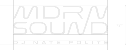


TheMDRN SOUND logo should always be viewed as a single entity, never separately.
For small-format presentations, use the symbol.
For presentations that require a specific format, use the secondary version if you cannot use the primary version.
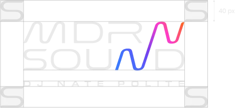
There must be an exclusion zone of at least 40 pixels or the height of the letter "S" around the logo when used digitally.
The logo should be reproduced in full color whenever possible, and when color is not an option, it should be used in black and white.
Logo Usage
Use the following examples as a reference to ensure the MDRN SOUND logo is applied correctly and consistently across all media and applications




On light backgrounds, always use the full-color logo or symbol to maintain brand integrity and visibility.
On brand-colored backgrounds, use the white version of the logo or symbol for optimal contrast.
On Gray backgrounds, apply the white logo or symbol to ensure clarity and brand consistency.
On dark or black backgrounds, use the white version of the logo or symbol to maintain legibility.
In black-and-white or single-color applications, use a solid black logo on white backgrounds for maximum clarity.
Logo Usage (Not-Allowed)


Never recompose or rearrange any part of the logo. The layout and proportions must remain intact at all times.
Never alter the position of any logo elements — including the icon and wordmark. Maintain the original alignment and spacing.
Never place the logo inside a shape or container smaller than the required clear space. This compromises legibility and visual impact.
Never modify the brand colors of the logo. Only use the approved color variations specified in this guide.
Never outline or apply strokes to the logo. Additional effects distort its appearance and weaken brand consistency.
Never place the logo on a background color that is not part of the approved brand palette.
Never use the logo on unrelated or distracting imagery. Backgrounds should always enhance, not compete with, the logo.
Never apply unapproved colors, gradients, or effects to the logo. Stick strictly to the brand-approved versions provided in this document.
Symbol Usage (Not-Allowed)
The following examples illustrate how to avoid improper use of the symbol. The symbol must never be combined with taglines, other company logos, or any additional graphic elements. It should always stand alone and be surrounded by the required clear space as defined in the exclusion zone guidelines.


Never recompose the symbol in any way.
Never remove or omit any part of the symbol in any application.
Never distort the symbol’s proportions—always scale it uniformly.
Never use solid strokes or blocks in place of or around the symbol.
Never apply gradients to the symbol that are not in the guide.
Never change the arrangement or positioning of any symbol elements.
Color Palette
Clarity
Hex Code: #E9E9E7
Pantone: 11-4800 TPG
CMYK: (0%, 0%, 1%, 9%)
RGB: (233, 233, 231)
Experience
Hex Code: #001953
Pantone: 7540 C
CMYK: (17%, 12%, 0%, 65%)
RGB: (74, 78, 89)
Professionalism
Hex Code: #0C0D11
Pantone: Black 6 C
CMYK: (30%, 24%, 1%, 93%)
RGB: (12, 13, 17)
Sound
Hex Code: #397BFF
Pantone: 2727 C
CMYK: (78%, 52%, 0%, 0%)
RGB: (57, 123, 255)
Excellence
Hex Code: #7440f2
Pantone: 2665 C
CMYK: (116, 64, 242)
RGB: (116, 64, 242)
Vibes
Hex Code: #FF3EC9
Pantone: 813 C
CMYK: (0%, 76%, 21%, 0%)
RGB: (255, 62, 201)
Passion
Hex Code: #FF642C
Pantone: 165 C
CMYK: (0%, 61%, 83%, 0%)
RGB: (255, 100, 44)
Color Instructions
HEX values are reserved for digital and web-based applications, ensuring precise color rendering across screens.
Pantone (Solid Coated) values are ideal for fabric swatches and should be used when producing branded apparel, merchandise, or corporate gifts.
CMYK values should be used for all print materials to ensure color accuracy and consistency.
RGB values are intended for on-screen use in documents, such as those created in Microsoft PowerPoint, Excel, and Word.
Dark Text for Light Backgrounds: Some brand colors remain legible with light text at higher opacities (e.g., 100%, 90%). However, when opacity drops below 40%, always switch to dark text to maintain sufficient contrast.
For example, if using blue #c4d7ff at 30% opacity as a background, avoid white or light-colored text and opt for a darker tone such as #001953 or black.
100% Presence Required:
Opacity variations may only be used if the 100% version of the color is already present in the document or layout. This ensures cohesion and reinforces brand identity.
Typography
Headings & Subtitles Font Family
Aa
Michroma
H1, H2, H3
Aa Bb Cc Dd Ee Ff Gg Hh Ii Jj Kk Ll Mm Nn Oo Pp Qq Rr Ss Tt Uu Vv Ww Xx Yy Zz
1234567890 £$?!<>{}[]#¢TM®
Body Copy Font Family
Aa
Manrope
H4, H5, P, Small, Caption
Aa Bb Cc Dd Ee Ff Gg Hh Ii Jj Kk Ll Mm Nn Oo Pp Qq Rr Ss Tt Uu Vv Ww Xx Yy Zz
1234567890 £$?!<>{}[]#¢TM®
Type Scales
H1
PT: 36
PX: 48
REM: 2.9 rem
Line Height: 1.4em
The quick brown fox jumps over the lazy dog
H2
PT: 30
PX: 40
REM: 2.4rem
Line Height: 1.4em
The quick brown fox jumps over the lazy dog
H3
PT: 25
PX: 33
REM: 2rem
Line Height: 1.4em
The quick brown fox jumps over the lazy dog
H4
PT: 21
PX: 28
REM: 1.7rem
Line Height: 1.4em
The quick brown fox jumps over the lazy dog
H5
PT: 17
PX: 23
REM: 1.4rem
Line Height: 1.4em
The quick brown fox jumps over the lazy dog
P
PT: 14
PX: 19
REM: 1.2rem
Line Height: 1.4em
The quick brown fox jumps over the lazy dog
Small P
PT: 10
PX: 16
REM: 0.8rem
Line Height: 1.4em
The quick brown fox jumps over the lazy dog
Caption
PT: 8
PX: 11
REM: 0.6rem
Line Height: 1.4em
The quick brown fox jumps over the lazy dog
Typography (Not-Allowed)
THIS IS A TITLE
THIS IS A SUBTITLE
LOREM IPSUM DOLOR SIT AMET, CONSECTETUER ADIPISCING ELIT, SED DIAM NONUMMY.
This Is a Title
This Is a Subtitle
Lorem ipsum dolor sit amet, consectetuer adipiscing elit, sed diam nonummy.
MDRN SOUND
This is a subtitle
Lorem ipsum dolor sit amet, consectetuer adipiscing elit, sed diam nonummy.
THIS IS A TITLE
THIS IS A SUBTITLE
LOREM IPSUM DOLOR SIT AMET, CONSECTETUER ADIPISCING ELIT, SED DIAM NONUMMY.
Do not use all caps unless specified. Maintain proper case formatting for readability and tone.
Do not use the same font weight for all text elements. Titles should be bold, while subtitles and body copy must remain regular.
Do not use any fonts other than the approved brand typeface when creating content for MDRN SOUND.
Do not use uniform sizing across all text. Maintain a clear visual hierarchy by differentiating font sizes for headings, subheadings, and body copy.
This Is a Title
This Is a Subtitle
Lorem ipsum dolor sit amet, consectetuer adipiscing elit, sed diam nonummy.
THIS IS A TITLE
This Is a Subtitle
Lorem ipsum dolor sit amet, consectetuer adipiscing elit, sed d i a m.
This is a title
This is a subtitle
Lorem ipsum dolor sit amet, consectetuer adipiscing elit, sed diam nonummy.
Do not adjust kerning or tracking excessively. All text should remain clean, balanced, and easy to read.
Do not justify all lines of text. Full justification disrupts natural reading flow and can create awkward spacing.
Do not use multiple font colors. Stick to the approved brand color palette and use color sparingly to maintain consistency.